Project Overview
Medcare: Your all-in-one healthcare app for seamless management of appointments, medical records, and personalized health recommendations. Take control of your well-being with ease and convenience.
Problem Statement
There is a need for medical care in a quick easy way to access health-care professional, any time any where. able to consulate your doctor and order your medications in the comfort of you’re home no need to hustle to get to the hospital.
Proposed Solution
To provide better healthcare access for everyone, a complete application with a combination of certain important features. These features will enable users to book appointments with health experts, buy prescribed sent by your doctor.
Why Medcare
I picked creating an app with health experts because I have come to realize that most people do not love talking to strangers, especially about their health care needs and concerns.
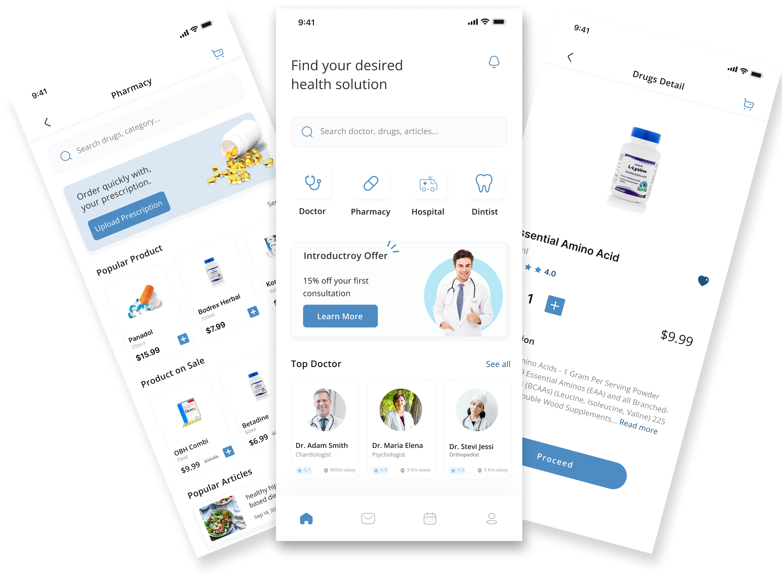
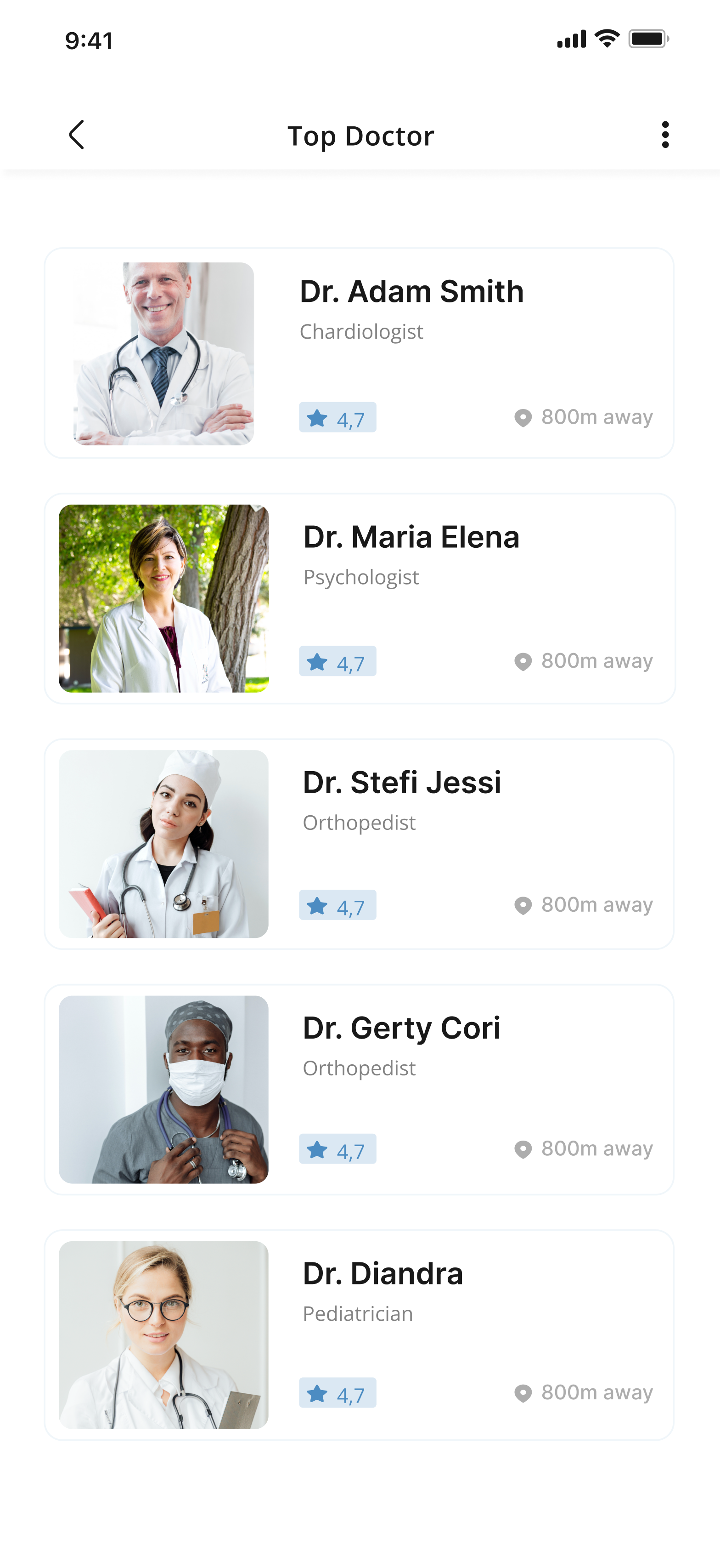
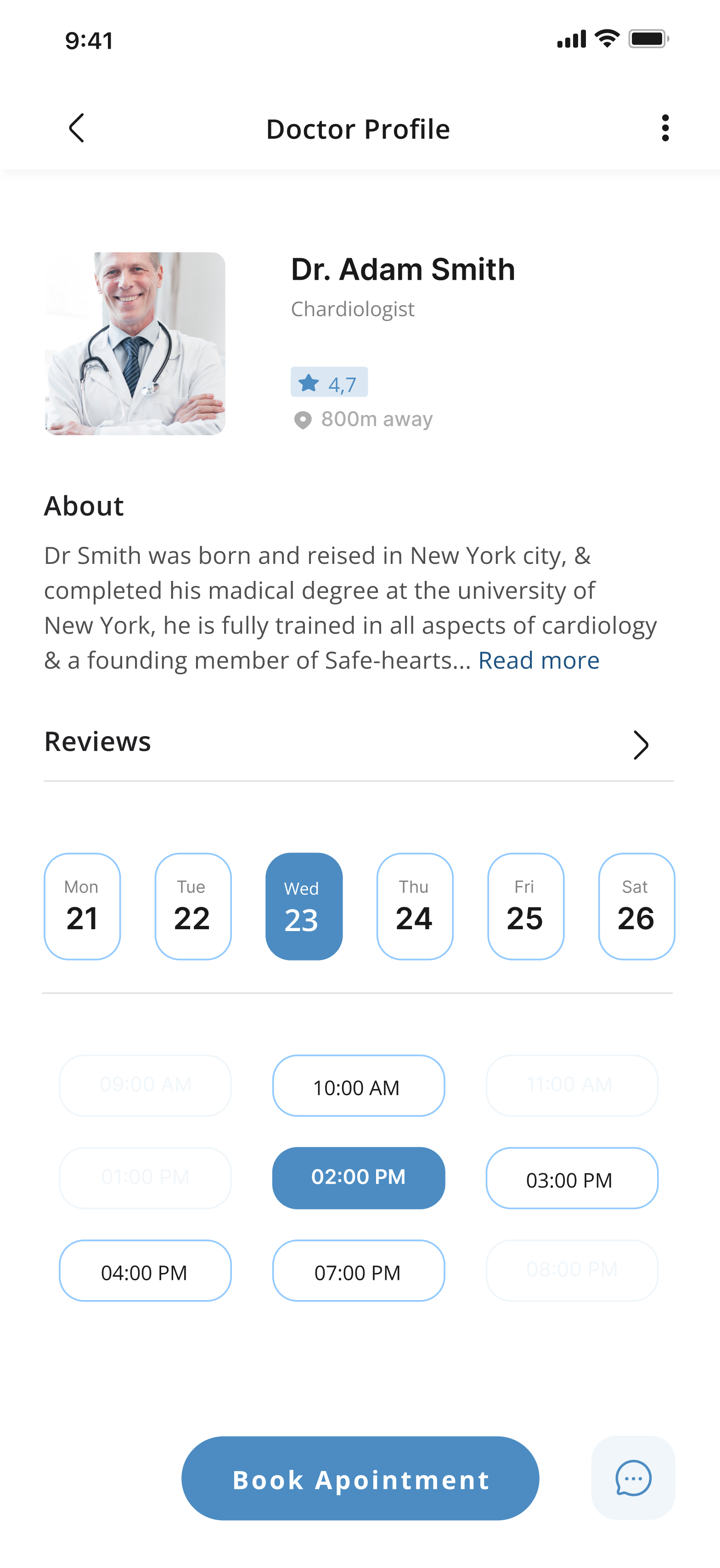
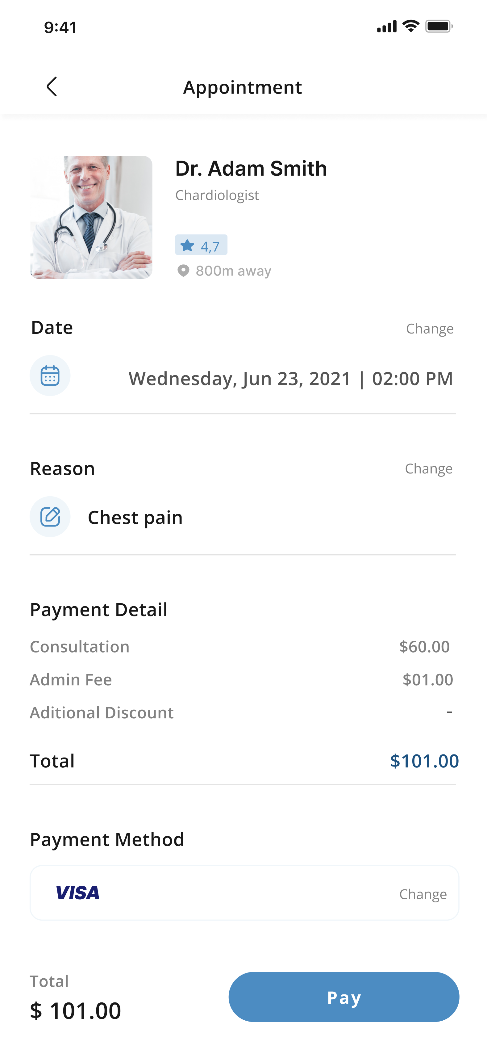
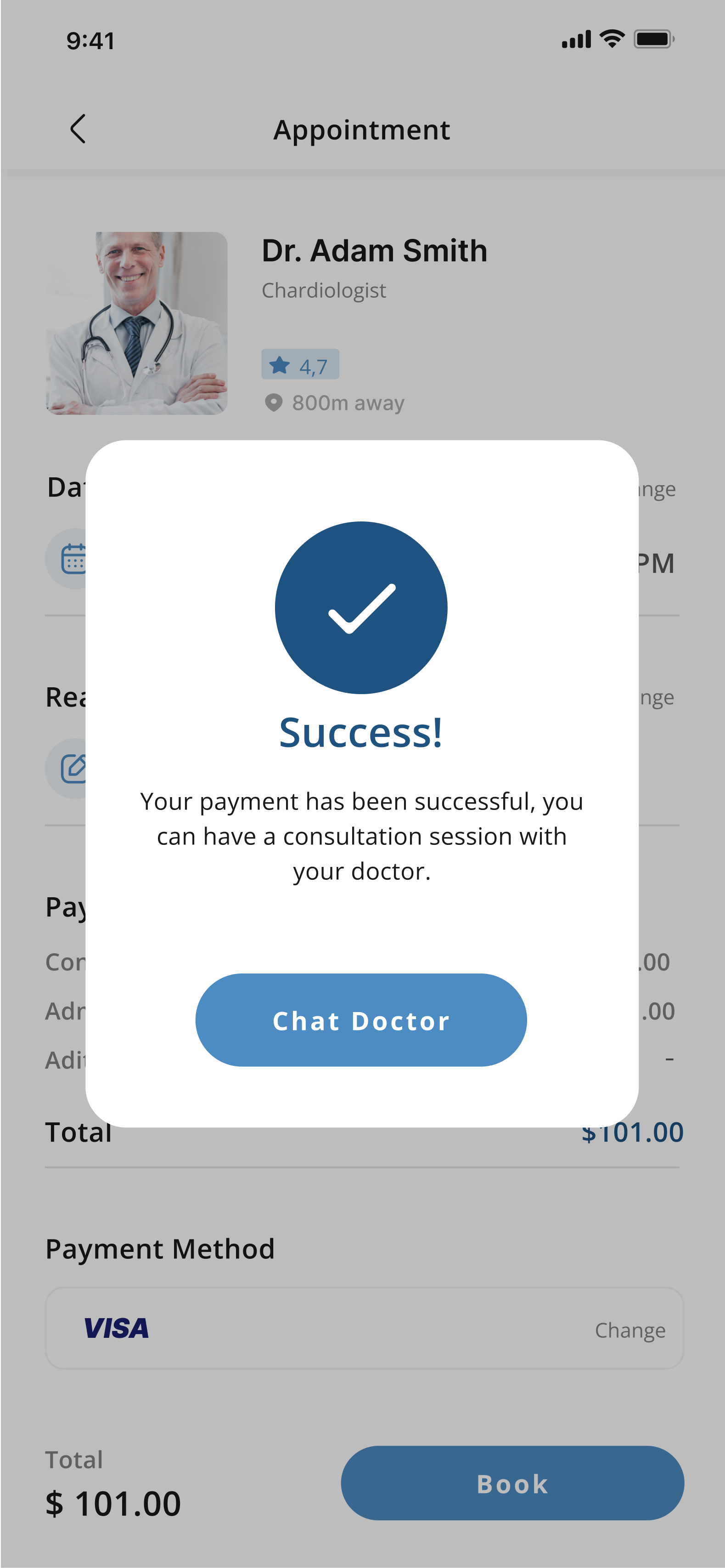
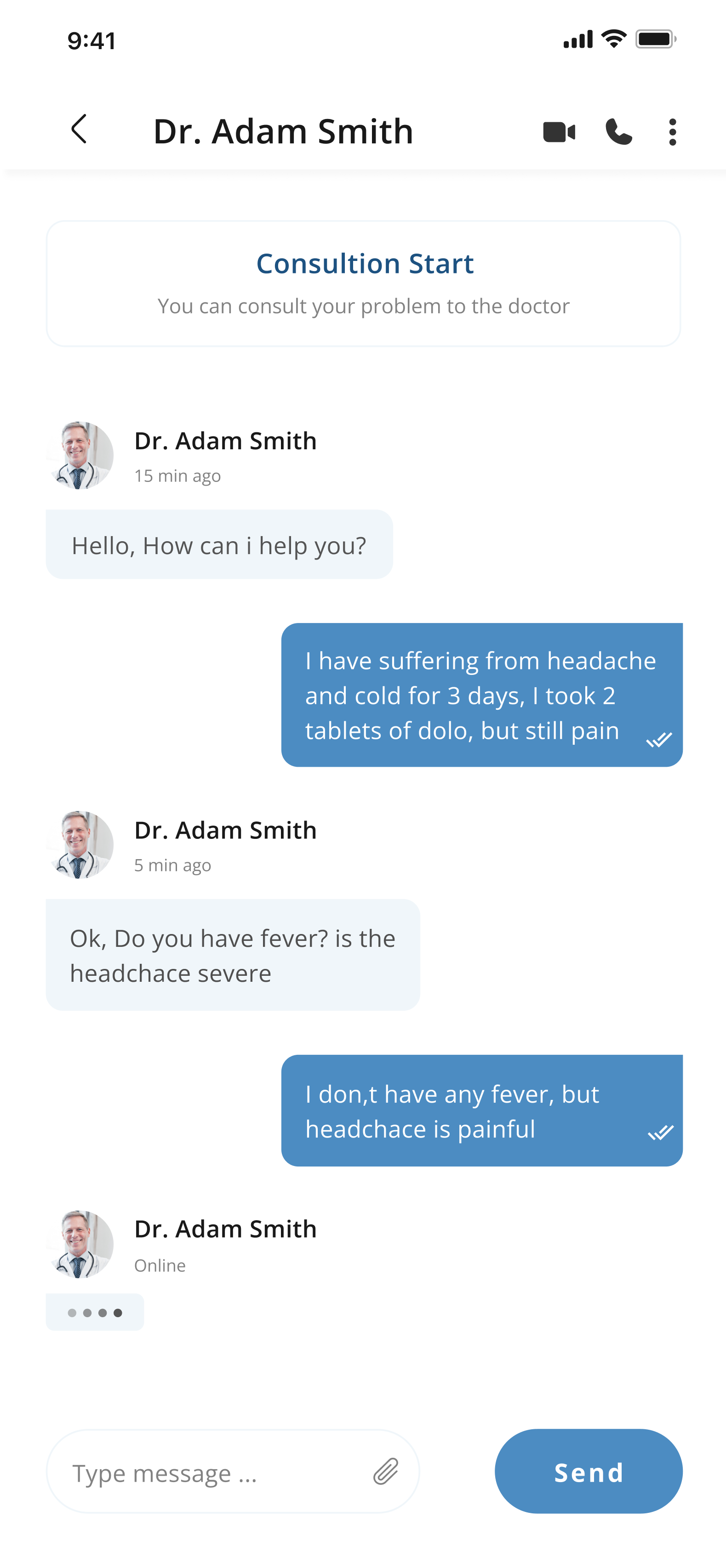
With Medcare, the user goes through picking a trusted primary care doctor, scheduling regular appointments with a doctor to discuss their concerns and overall health. Besides these features, the users can order for their prescription and also read from various health articles.
With Medcare, the user goes through picking a trusted primary care doctor, scheduling regular appointments with a doctor to discuss their concerns and overall health. Besides these features, the users can order for their prescription and also read from various health articles.

Competitive Analysis
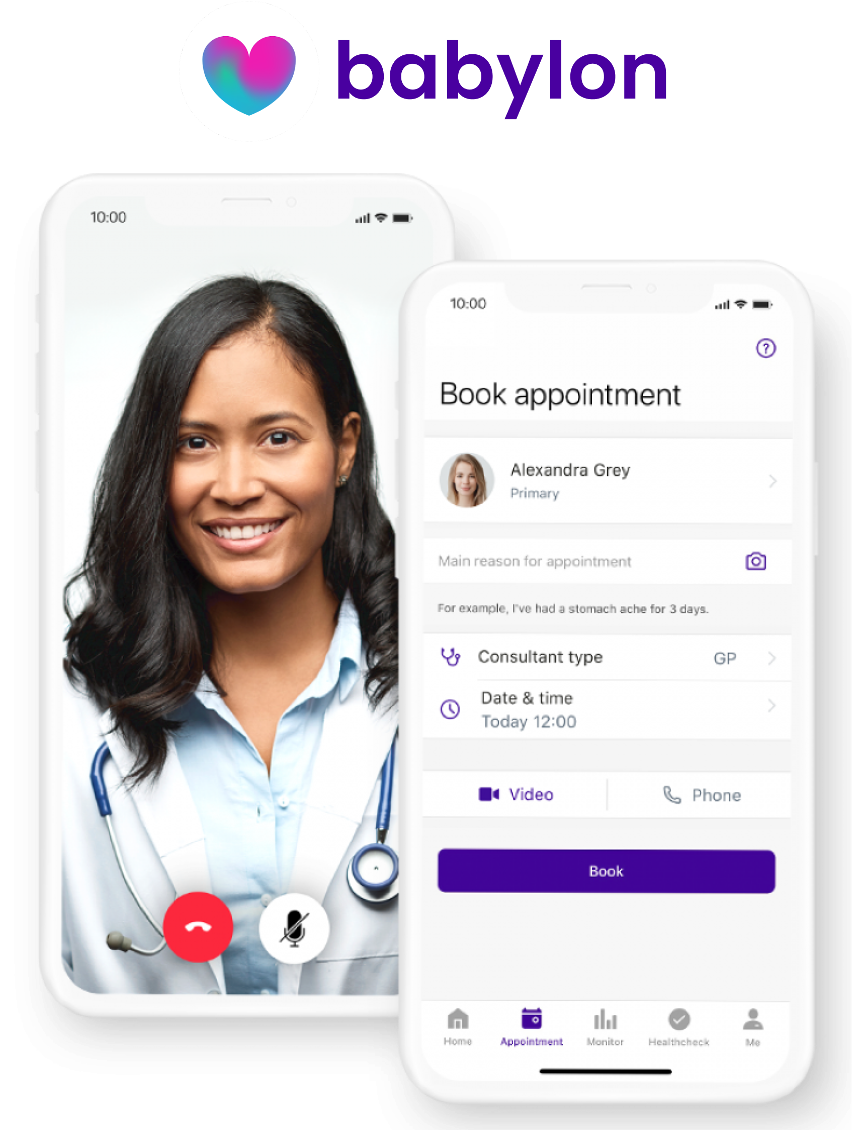
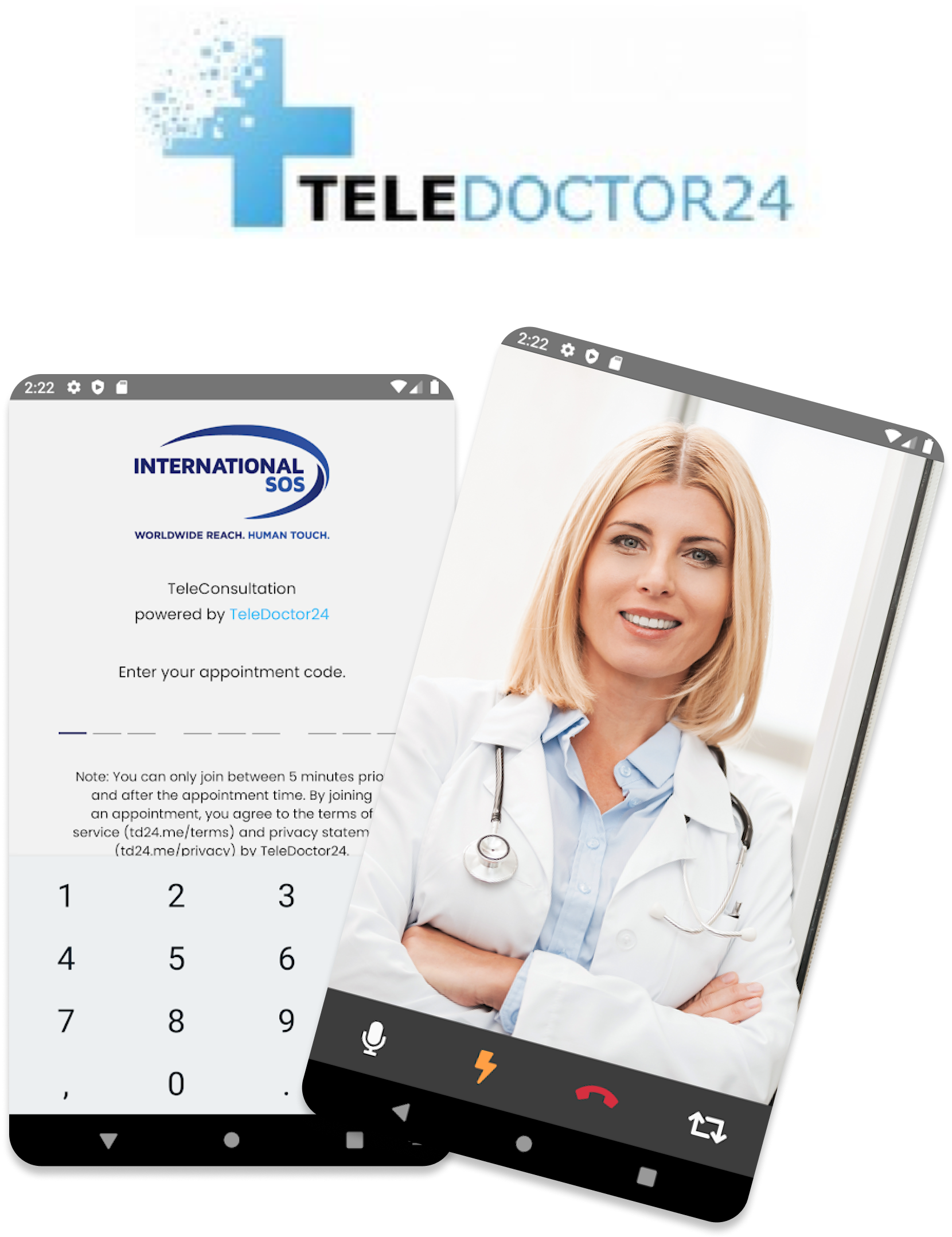
Conducting a SWOT analysis is a strategic approach to identify Strengths, Weaknesses, Opportunities, and Threats in business or project planning. To position Medcare effectively in the market, I analyzed two similar apps, gaining insights into competitors' strengths, weaknesses, opportunities, and threats, aiding in formulating Medcare's competitive strategy.
Strengths
- User friendly interface, easy to navigate.
- Addition of extra features like Mood Check.
- Lower price rate for consultation.
Weaknesses
- No social media ads.
- Home page doesn't have enough information.
- Bottom Nav and Icons are not labelled.
Opportunities
- Run social media ads to increase awareness.
- Home page should include more information and features.
- Bottom Nav and Icons should be labelled.
Threats
- Apps like TeleDoctor24 and BetterHelp are well known.
- A lack of context and information on the home page give a bad impression.
Strengths
- Availability of a wide range of partner pharmacies.
- User friendly interface, pretty straightforward.
- Addition of extra features like e-prescription.
Weaknesses
- No website.
- No in-app pharmacy available.
- Signing-up process is too long.
Opportunities
- Should create a website.
- Should include more language options.
- Home page should include more information and content.
Threats
- Apps like Babylon and BetterHelp might be a threat.
- Users have no website to refer to for more information.
Research Survey
Through a user survey, I engaged with multiple users using multiple choice questions, expanding the outreach and gathering valuable insights. The survey results served as a foundation for crafting interview questions, allowing for a deeper exploration of the findings and gathering more comprehensive data.
How often do you enter info on a web site or an app about an illness or health issue?
120 people answered this question.
Have you ever used a health-related website or an app to track your health?
65 people answered this question.
Which features are least important to you?
76 people answered this question.
How often do you visit a doctor?
30 people answered this question.
Would you use an app where you can get a personalized info regarding your health?
52 people answered this question.
Would you be willing to pay for an app that provides you with personalized health info?
20 people answered this question.
Survey insights:
- Out of 45% out of 20 participants visit the doctor only when ill. The rest visit once a month and few times a year.
- Over 60% of the participants have sent and received email from the doctor and also make use of health related websites or application.
- 80% of the participants would use an app where they can get personalized info regarding their health.
- 60% of the participants would be willing to pay for an app that provides them with personalized health info.
User Interviews
Interviews helped me understand the problem and pain points, as well as potential customers of Medcare. I got to understand their mental models frustrations, needs goals, suggestions and challenges. I categorized the findings into common themes.
Interview insights:
- Users want to be able to book an appointment with a doctor online.
- Users want to be able to get a reminder for their appointment.
- Users want to be able to get their medications delivered to them.
- Users want to be able to pay for their consultation with their insurance.
- Users want to be able to get personalized health information.
User Journey
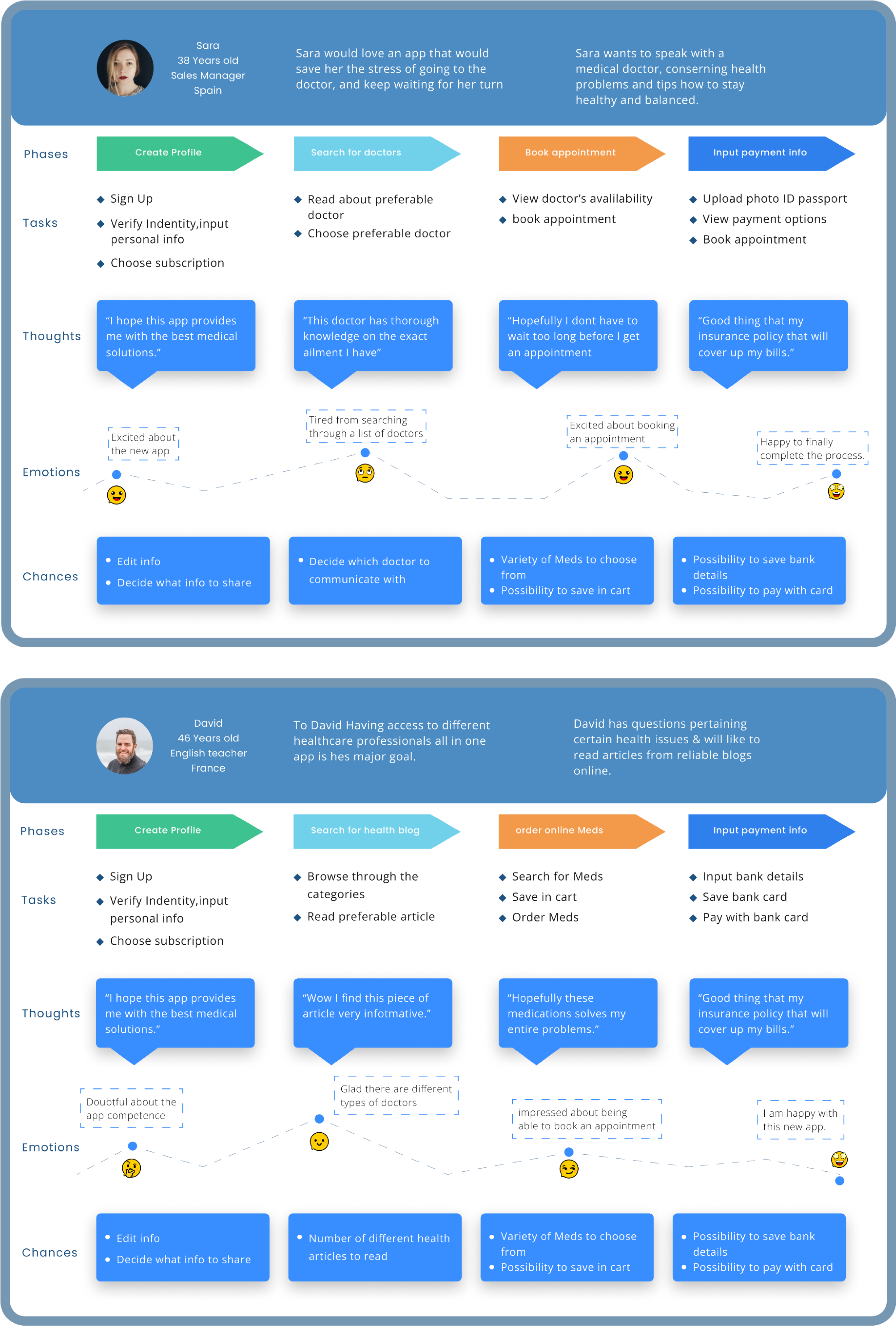
User journey map helped me understand the context of users and gave a clear image of the steps the users would go through when engaging with the Application.
User Flow
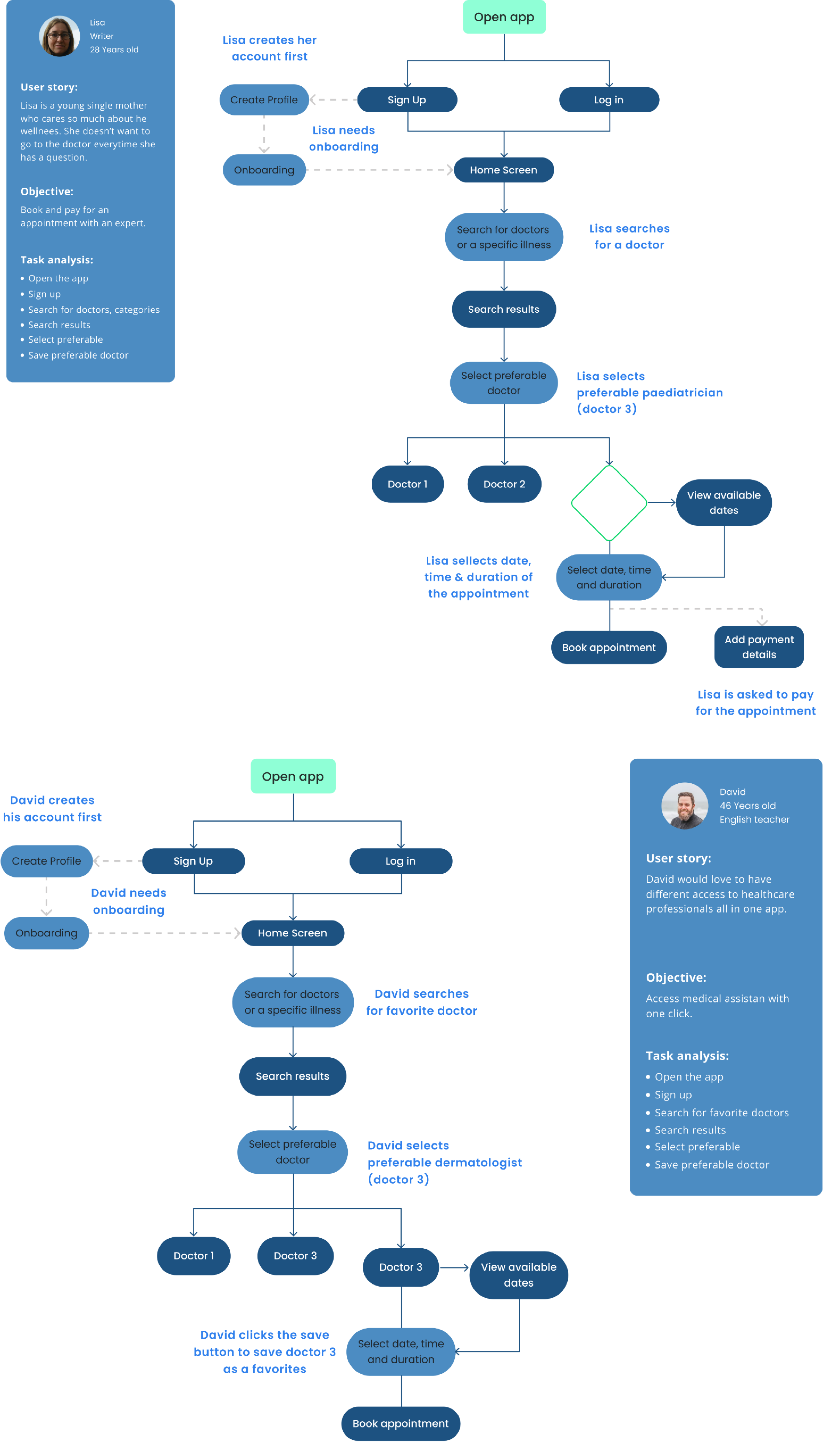
At this point, the project had become well-grounded. I had thorough understanding about its core features, functionality and structure. The goal of this stage was to organize and structure all the content from the research phase. I created a basic flow of each step on the path of the users.
Site Map
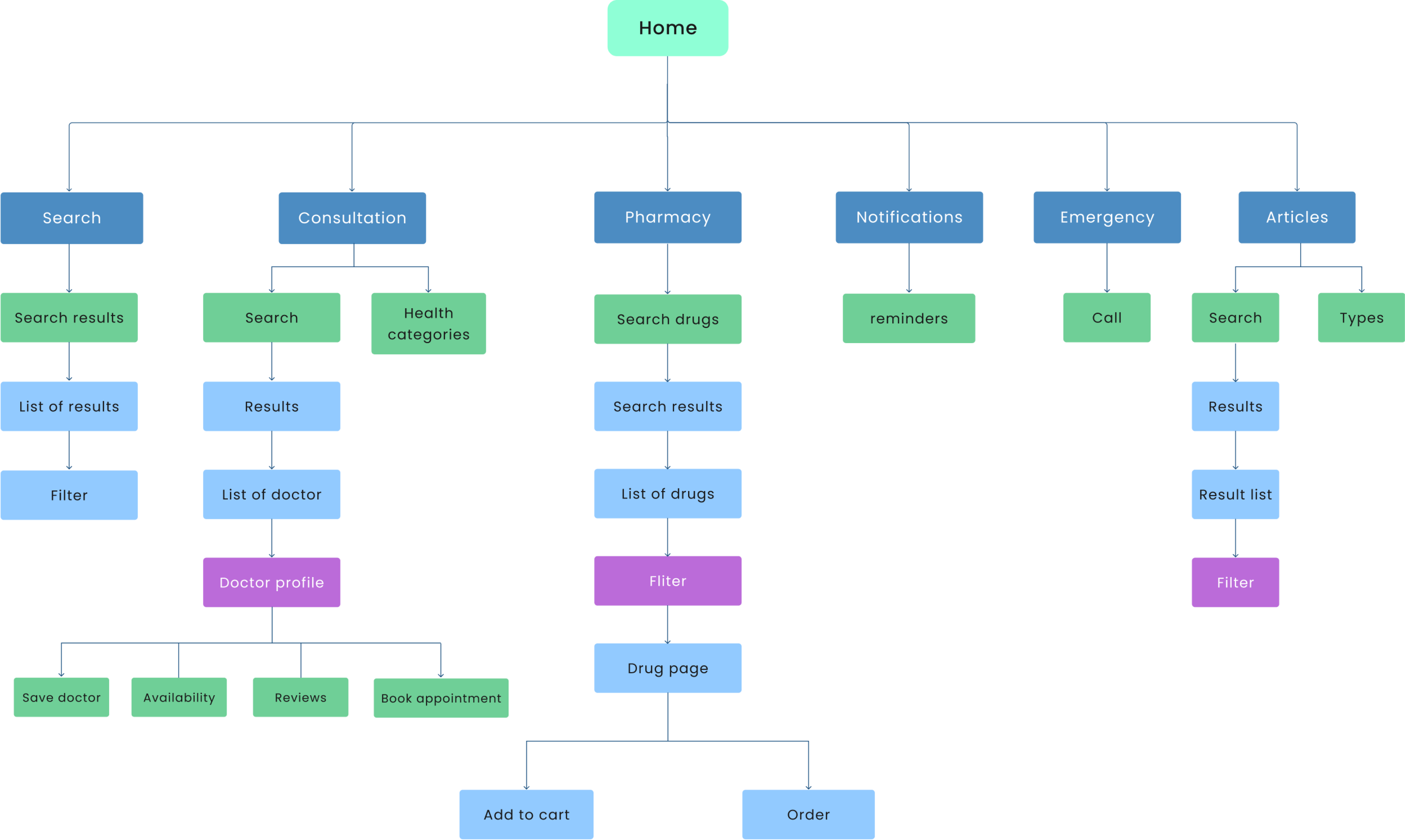
At this stage, I used the card sorting method to help define, the design and evaluate the information architecture of the app. In the card sorting session, participants organized and labelled cards and features into categories that made sense to them.
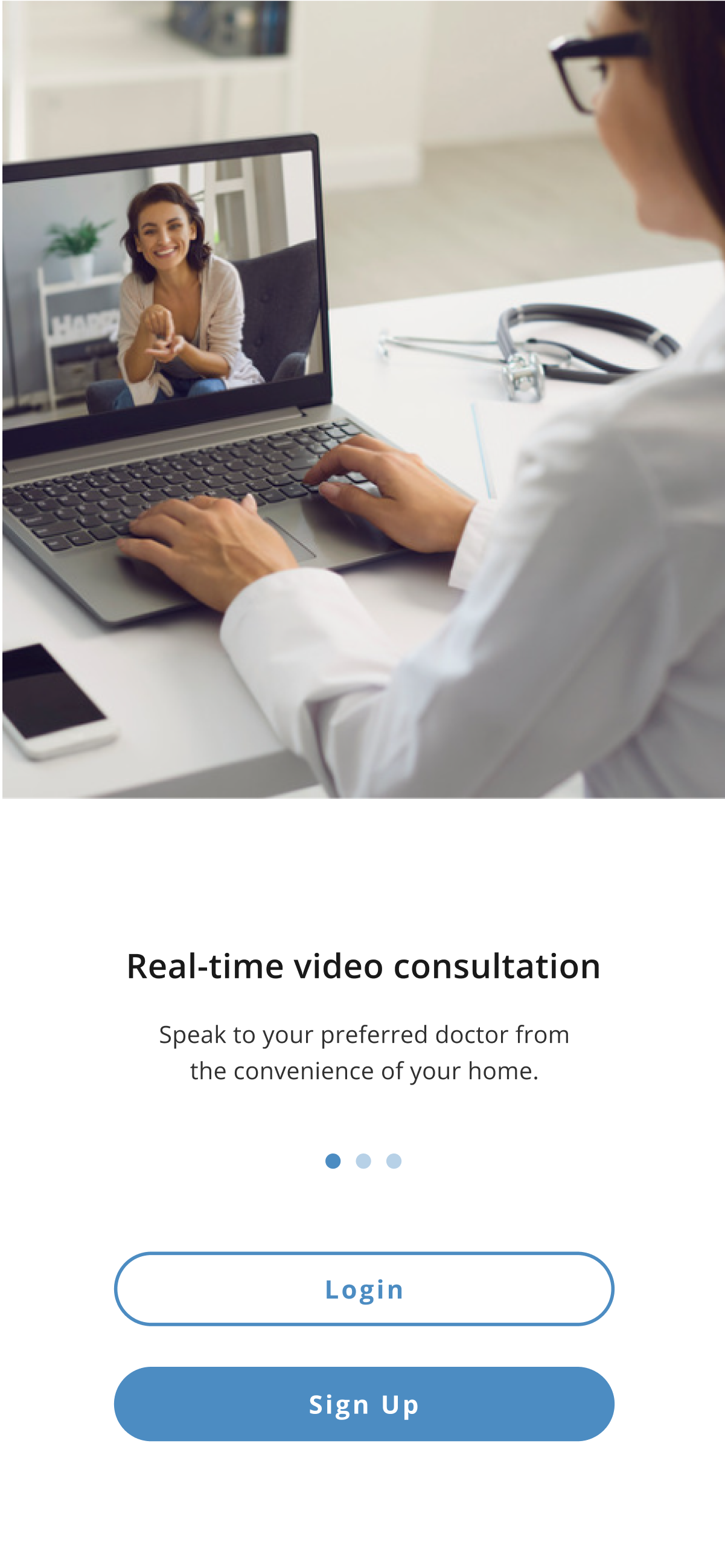
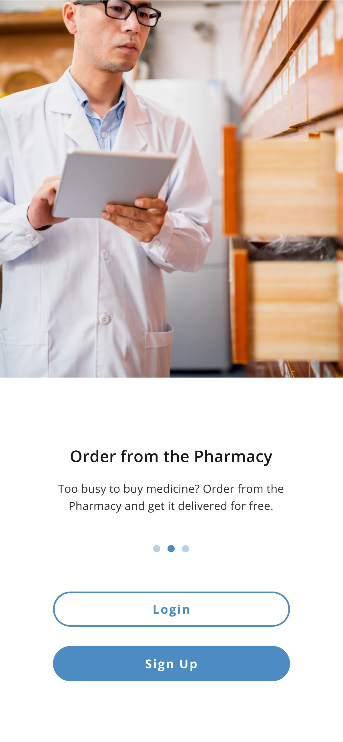
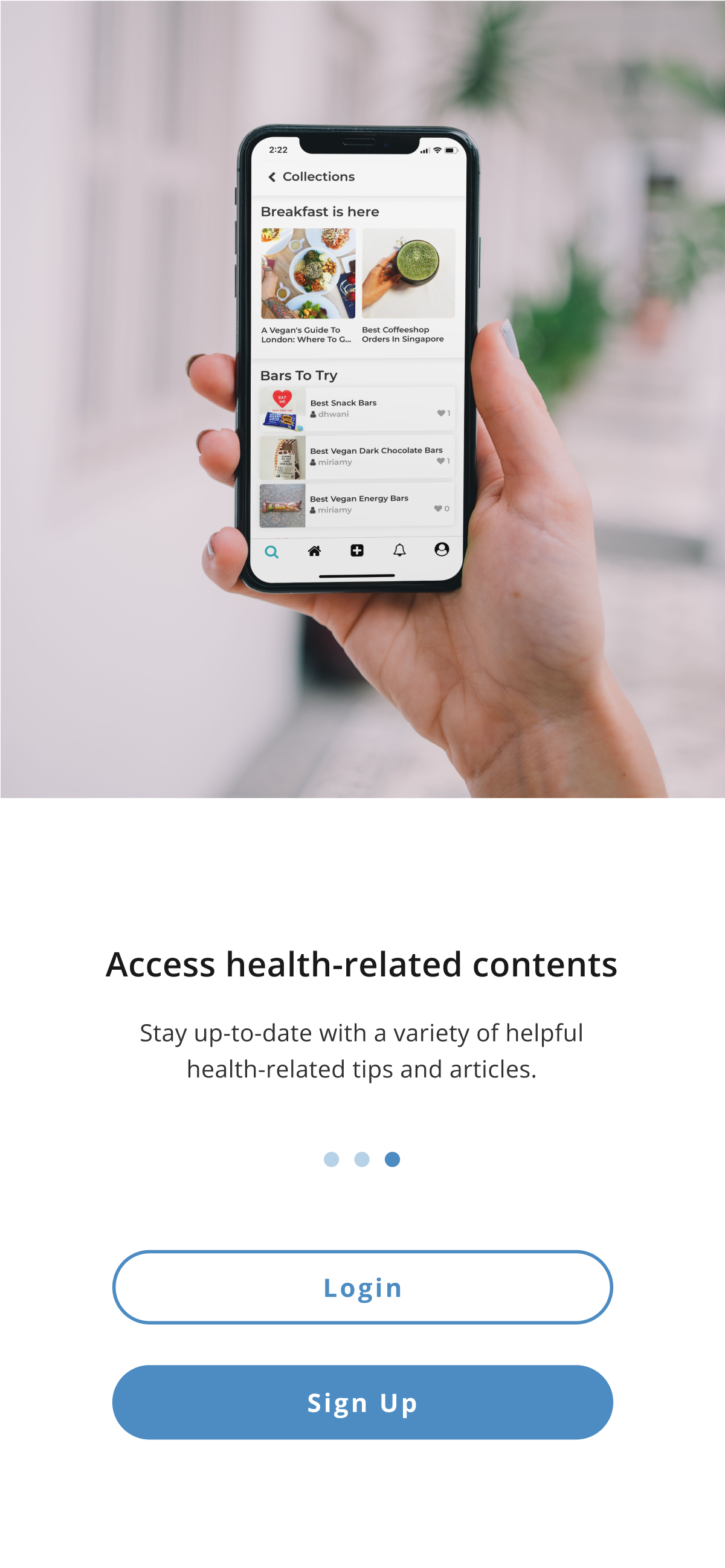
Onboarding


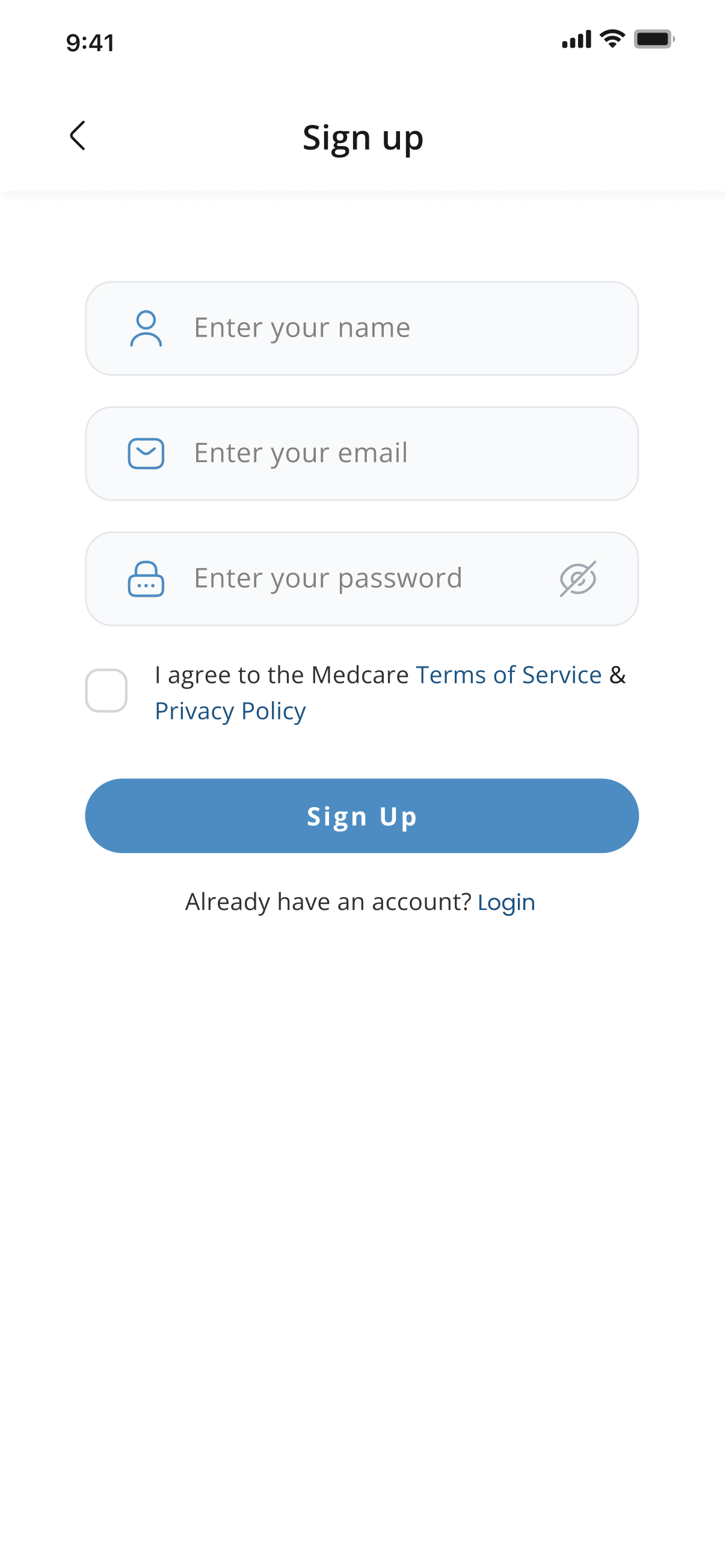
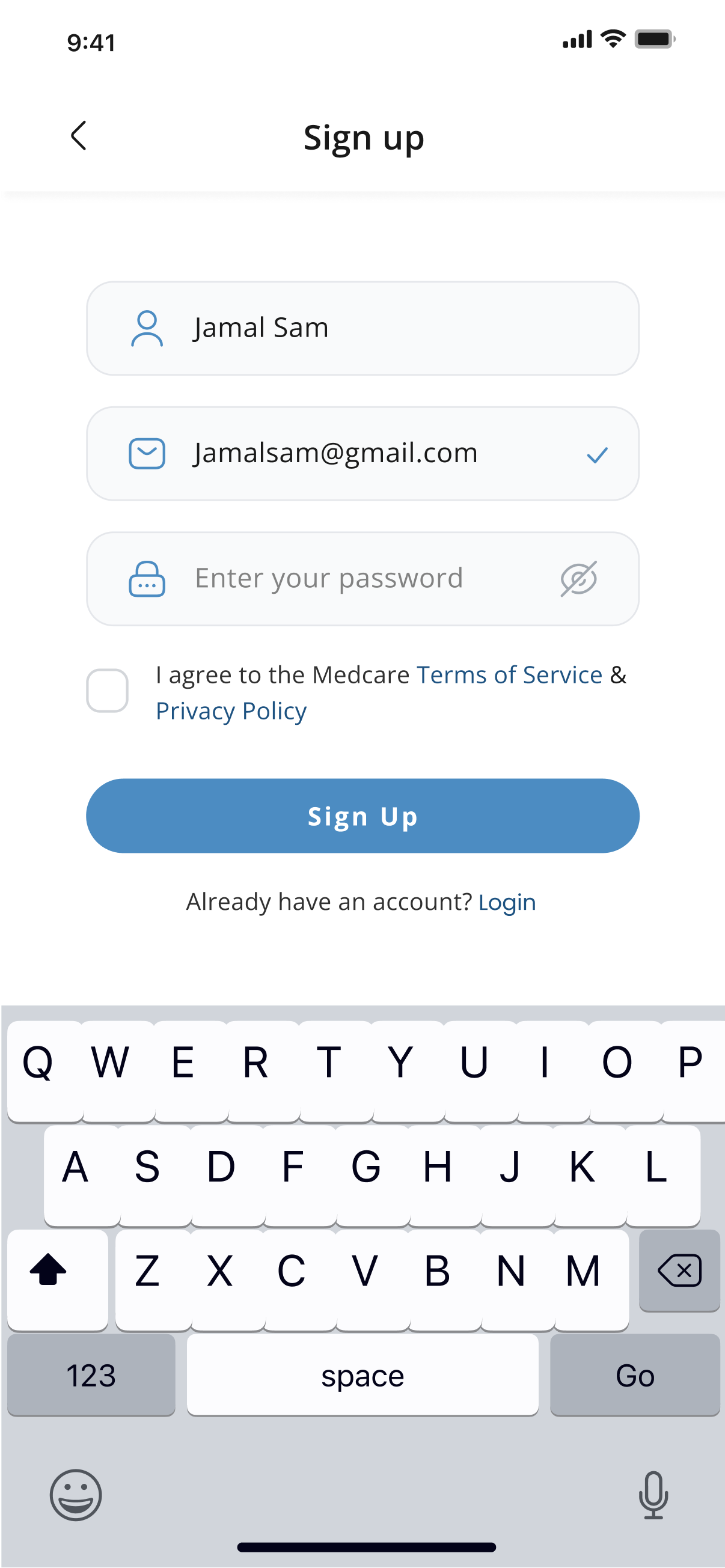
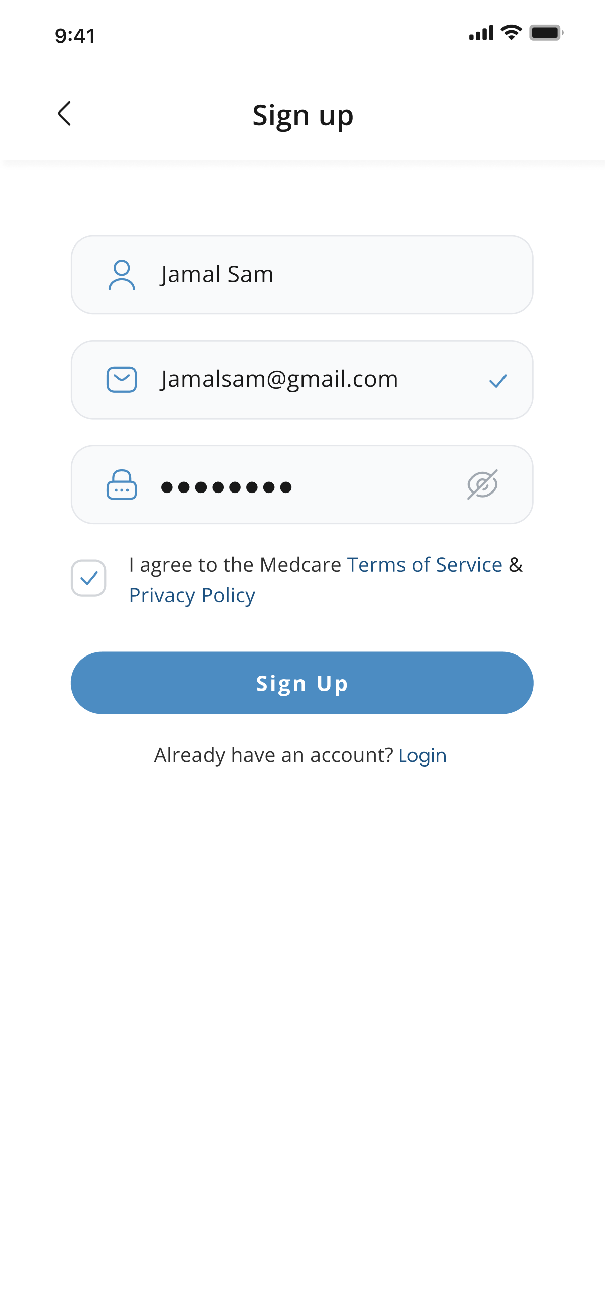
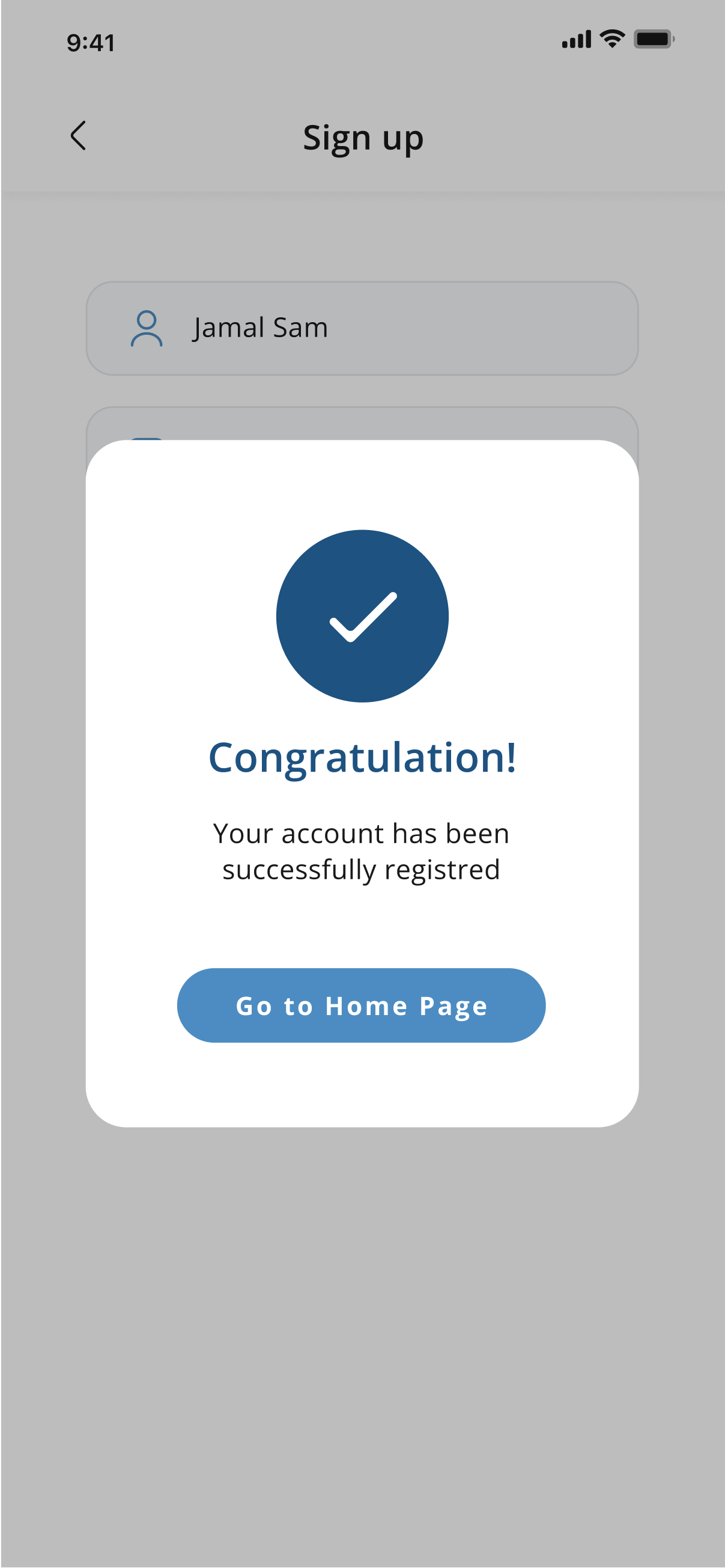
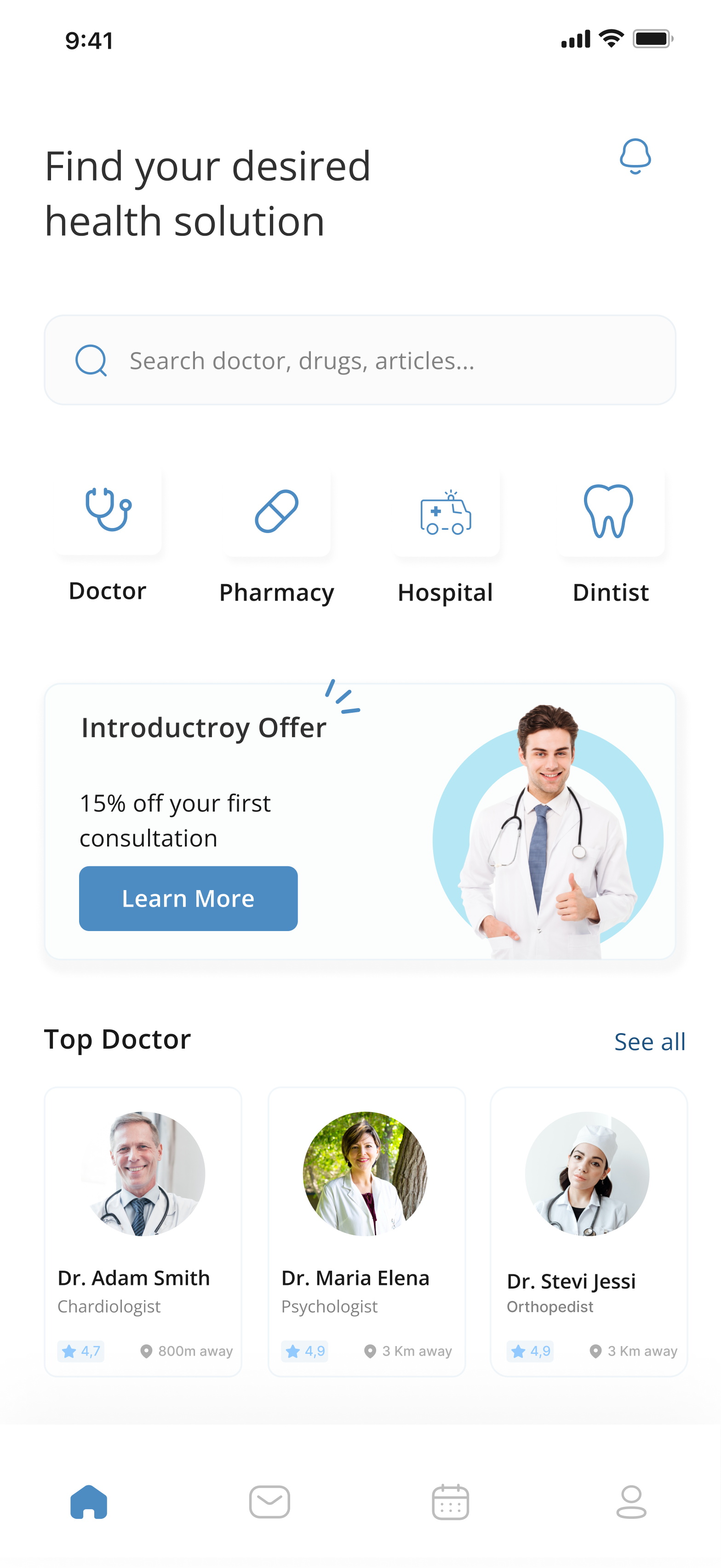
Home Screen
Book Appointment
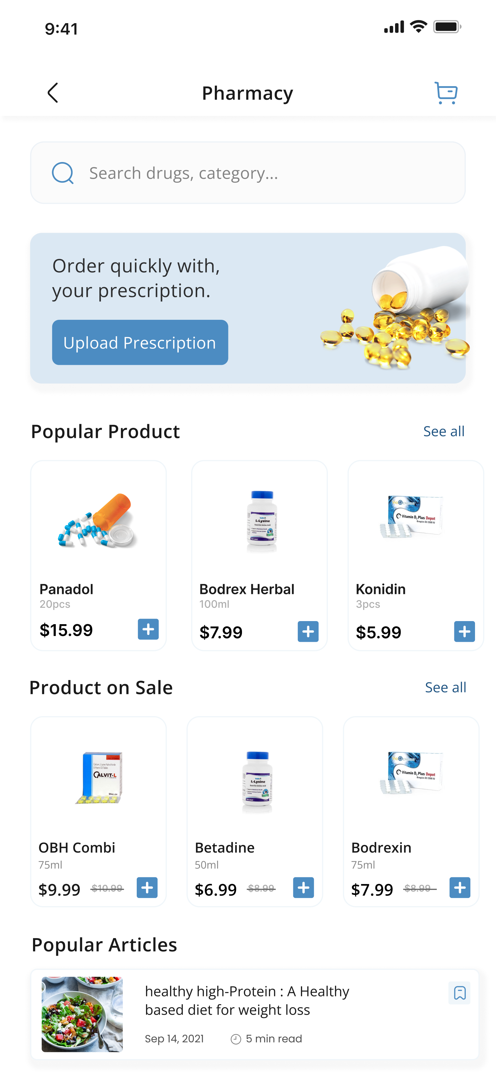
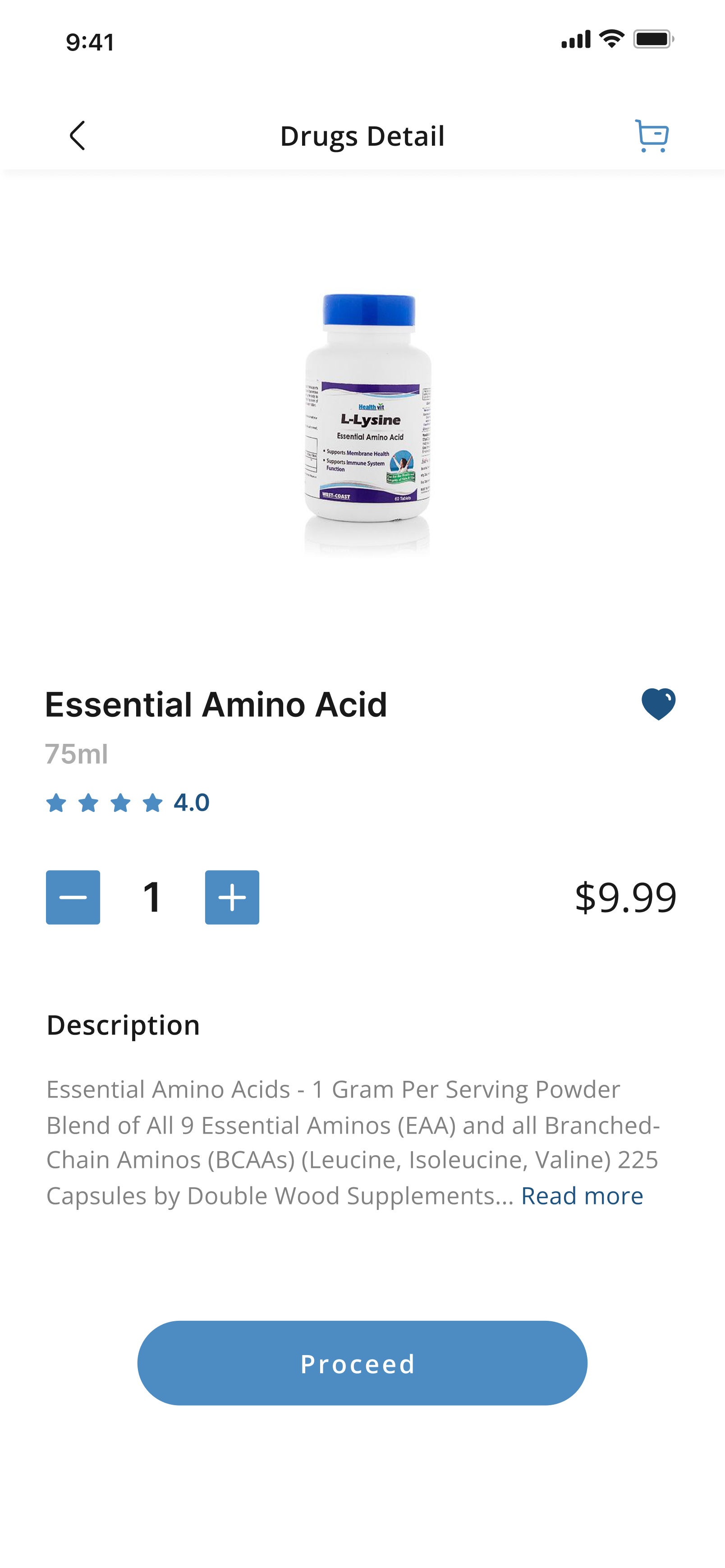
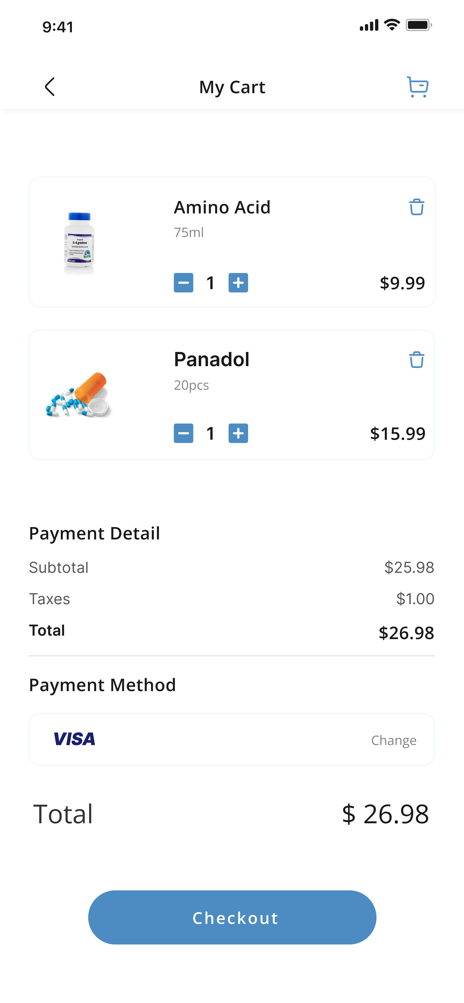
Pharmacy
